Adoptive Headers Using CSS

Creating three adoptive headers using CSS:
- Horizontally-header scroll
- Make a nav Menu Available from a fixed-position Header
- Sticky Header
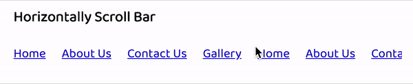
1. Horizontally header scroll
The links are wrapping onto a second line.
What if we don’t want to wrap links? 🤔
Let’s target all the links in our nav and make sure it does not wrap. To do that we will apply white-space: nowrap; to nav. So, the line will be on the first line and does not wrap.
The scroll behaviour was not much smooth. So, added smooth as -webkit-overflow-scrolling on nav.
<html>  <body>
    <div>      <nav>        <a href="#">Home</a>        <a href="#">About Us</a>        <a href="#">Contact Us</a>        <a href="#">Gallery</a>        <a href="#">Home</a>        <a href="#">About Us</a>        <a href="#">Contact Us</a>        <a href="#">Gallery</a>        <a href="#">Home</a>        <a href="#">About Us</a>        <a href="#">Contact Us</a>        <a href="#">Gallery</a>        <a href="#">Home</a>        <a href="#">About Us</a>        <a href="#">Contact Us</a>        <a href="#">Gallery</a>      </nav>        <p>Hello World!</p>    </div>
  </body></html>
nav { display: flex; overflow-x: auto; margin: 10px 0; -webkit-overflow-scrolling: touch;}a { margin: 0 10px; white-space: nowrap;}OUTPUT:
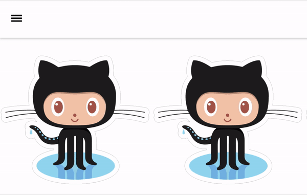
2. Make a Nav Menu Available from a fixed-position Header ⏣
To create nav Menu with fixed header: (using jQuery)
We will be adding menu icon, where we are toggling the ‘nav’ on the tap of ≡(menu) icon.
We will make sure to give position fixed to both header and nav. So, it should be fixed at the top of the page.
<html>  <script src="https://ajax.googleapis.com/ajax/libs/jquery/3.0.0/jquery.min.js"></script>
  <body>    <header>      <div id="title">Logo</div>      <div id="menu-icon">≡</div>    </header>
    <nav>      <ul>        <li>Home</li>        <li>Settings</li>        <li>Profile</li>        <li>Pictures</li>      </ul>    </nav>
    <div class="container">      <img src="https://techstickerhub.com/images/demo/shop/GitHub.jpg">      <img src="https://techstickerhub.com/images/demo/shop/GitHub.jpg">      <img src="https://techstickerhub.com/images/demo/shop/GitHub.jpg">      <img src="https://techstickerhub.com/images/demo/shop/GitHub.jpg">      <img src="https://techstickerhub.com/images/demo/shop/GitHub.jpg">    </div>
</body></html>html,body { margin: 0; padding: 0;}header { position: fixed; background-color: white; padding: 10px 20px; display: flex; justify-content: space-between; align-items: center; box-shadow: 0 1px 5px #bbb; width: 95%;}.container { padding-top: 50px;}img { width: 300px; border-bottom: 1px solid #ccc;}img:last-child { border-bottom: none;}#menu-icon { font-size: 30px; cursor: pointer;}nav { display: none; position: fixed; top: 56px; left: 0; right: 0; bottom: 0; font-size: 15px; background-color: rgba(0, 0, 0, 0.5);}ul { background-color: #73d796; margin: 0; padding-left: 20px; list-style: none}li { padding: 20px 0;}$("#menu-icon").on("click", () => { $("nav").toggle();})// when user taps to nav it should close$("nav").on("click", () => { $("nav").toggle()}).children().on("click", () => { // it will close the nav on tap of nav list return true;})OUTPUT:
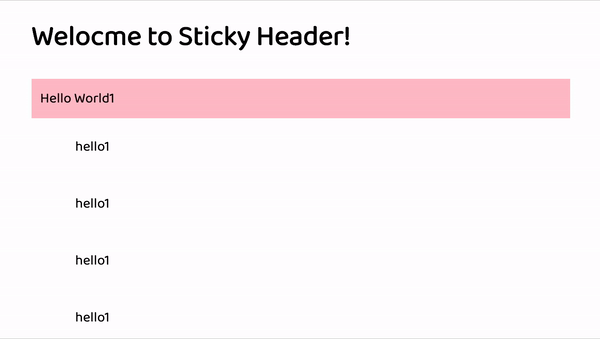
3. Sticky Header 🔥
Here we are taking an example of <dt>, <dd> tag to explain the sticky header. Position sticky will manage the <dt> to place at the top of position as sticky. To do that, we need to add position: sticky; position: -webkit-sticky (to target webkit browser) to <dt> tag.
If we need to stick the <dt> tag at the top of page then we need to give top: 0px. The top property specify the vertical offset from its normal position. So, top: 20px would make <dt> tag sticky 20px down from the top.
The description term(dt tag) , where header-stays fixed at the top of the page. As we scroll down and we get to the next section, it takes over the first header and so on.
<html><head>    <title>Sticky header</title></head><body>    <h1>Welocme to Sticky Header! </h1><dl>    <dt>Hello World1</dt>    <dd>hello1</dd>    <dd>hello1</dd>    <dd>hello1</dd>    <dd>hello1</dd>
    <dt>Hello World2</dt>    <dd>hello1</dd>    <dd>hello1</dd>    <dd>hello1</dd>    <dd>hello1</dd>
    <dt>Hello World3</dt>    <dd>hello1</dd>    <dd>hello1</dd>    <dd>hello1</dd>    <dd>hello1</dd>
    <dt>Hello World3</dt>    <dd>hello1</dd>    <dd>hello1</dd>    <dd>hello1</dd>    <dd>hello1</dd></dl></body></html>
dt { position: sticky; top: 0; position: -webkit-sticky; background: pink; padding: 10px;}dd { padding: 20px 10px; }OUTPUT: