CSS Blend Mode

The **`
For each pixel among the layers to which it is applied, a blend mode takes the colors of the foreground and the background, perfoms a calculation on them, and returns a new color value. 💥
A. mix-blend-mode 🎨
The mix-blend-mode property defines how an element’s content should blend with its background. This means that any images or text, borders or headings will be influenced by this property
Synatx:mix-blend-mode: VALUE;Values:
1. normal
This is default. Sets the blending mode to normal
mix-blend-mode: normal;
2. multiply
The element is multiplied by the background and replaces the background color. The resulting color is always as dark as the background.
mix-blend-mode: multiply;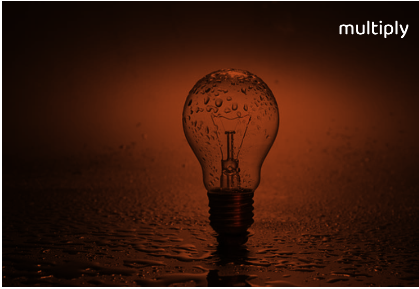
3. screen
Multiplies the background and the content then complements the result. This will result in content which is brighter than the background-color.
mix-blend-mode: screen;
4. overlay
Multiplies or screens the content depending on the background color. This is the inverse of the hard-light blend mode
mix-blend-mode: overlay;
5. darken
The background is replaced with the content where the content is darker, otherwise, it is left as it was.
mix-blend-mode: darken;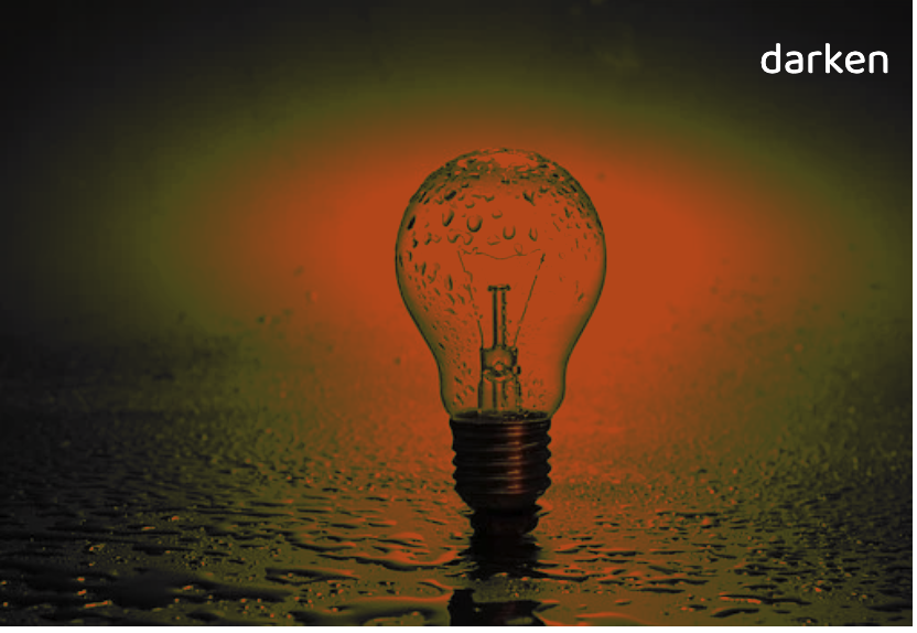
6. lighten
The background is replaced with the content where the content is lighter.
mix-blend-mode: lighten;
Also, tried the lighten effect on text which looks cool 🤩
index.html:<div> <h1>Ё</h1> <img src="https://pablogs.io/images/posts/spritekit/backgroundscroll/background.gif" /> </div>div { position: relative; width: 200px; height: 200px; background-color: white;}h1 { font-size: 8vw;}img { position: absolute; top: 0; left: 0; width: 100%; height: inherit;}img { mix-blend-mode: lighten;}
Check out the more designs here in @codepen 🔥

7. color-dodge
This attribute brightens the background color to reflect the color of the content.
mix-blend-mode: color-dodge;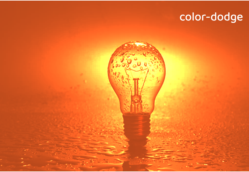
8. color-burn
This darkens the background to reflect the content’s natural color.
mix-blend-mode: color-burn;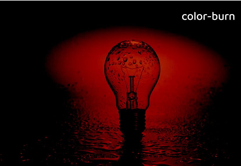
9. hard-light
Depending on the color of the content this attribute will screen or multiply it.
mix-blend-mode: hard-light;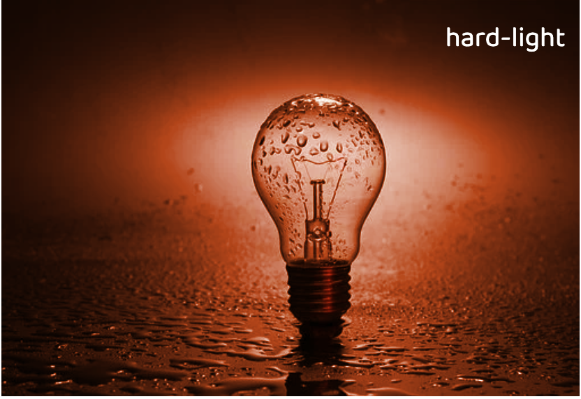
10. soft-light
Depending on the color of the content this will darken or lighten it.
mix-blend-mode: soft-light;
11. difference
This subtracts the darker of the two colors from the lightest color.
mix-blend-mode: difference;
12. exclusion
Similar to difference but with lower contrast.
mix-blend-mode: exclusion;
13. hue
Creates a color with the hue of the content combined with the saturation and luminosity of the background.
mix-blend-mode: hue;
14. luminosity
Creates a color with the luminosity of the content and the hue and saturation of the background. This is the inverse of the color attribute.
mix-blend-mode: luminosity;
15. Initial
The default setting of the property that does not set a blend mode.
mix-blend-mode: initial;16. Inherit
An element will inherit the blend mode from its parent element.
mix-blend-mode: inherit;17. Unset
Removes the current blend mode from an element.
mix-blend-mode: unset;You can find the code in @codepen
B. background-blend-mode 🎨
The background-blend-mode property defines how an element’s background-image should blend with its background-color.
background-blend-mode: VALUE;`VALUE` are same as mix-blend-mode.
Example: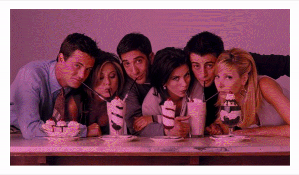
<div></div>div { width: 40rem; height: 20rem; background-image: url(https://hips.hearstapps.com/digitalspyuk.cdnds.net/17/09/1488375386-1488370326-friends-cast.jpg); background-size: cover; background-blend-mode: multiply; animation: color 5s ease-in-out infinite;}
@keyframes color { 12% { background-color: #ea529f; }
24% { background-color: #28d128; }
36% { background-color: violet; }
48% { background-color: orange; }
60% { background-color: #ad5bea; }
72% { background-color: yellow; }
84% { background-color: #6262ea; }
90% { background-color: #e63d3d; }
100% { background-color: transparent; }}What's the difference between background-blend-mode and background-blend-mode ❓🤔
background-blend-mode blends with its background-image and its background-color.
mix-blend-mode blends with its backdrop, the part what is behind itself, and its background-color.
Isolation 👻
The isolation property in CSS is used to prevent elements from blending with their backdrops.
It is most commonly used when mix-blend-mode has been declared on another element. Applying isolation to the element guards that element so that it does not inherit the mix-blend-mode applied to the other elements that might be behind it.
It’s like a way to turn off mix-blend-mode, but from a parent element rather than needing to select the element with blending directly.
Syntax:isolation: VALUES;Values:
isolate: Does exactly what it says. It protects the element from blending into other elements that are in the backdrop.
auto: Resets the isolation and allows the element to blend into its backdrop.
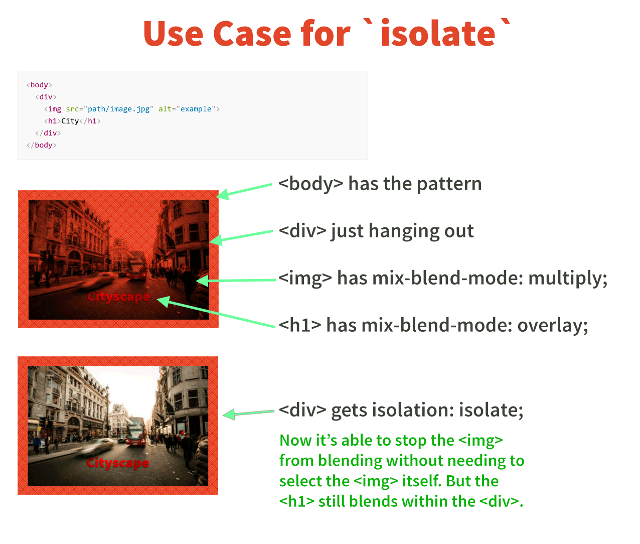
NOTE: Isolation does not work with background-blend-mode as background elements are already isolated by their nature in that they do not blend with the content that is behind them.
Reference 🧐
Thanks for reading the article ❤️
I hope you love the article. If you have any question, please feel free to ping me on @suprabhasupi 😋