CSS Backdrop filter

The backdrop-filter property in CSS is used to apply filter effects (grayscale, contrast, blur, etc) to the background/backdrop of an element. The backdrop-filter has the same effect as the filter property, except the filter effects are applied only to the background and instead of to the element’s content.
Syntax:backdrop-filter: <filter-function> [<filter-function>]* | none `
- blur()
- brightness()
- contrast()
- drop-shadow()
- grayscale()
- hue-rotate()
- invert()
- opacity()
- saturate()
- sepia()
- url() – (for applying SVG filters)
You can apply multiple <filter-function/> to a backdrop.
backdrop-filter: grayscale(0.5) opacity(0.8) // .... and more<div class="container"> <div class="content"> <p> Lorem ipsum dolor sit amet, consectetur adipisicing elit. </p> <p> Lorem ipsum dolor sit amet, consectetur adipisicing elit. Officiis, quae distinctio magnam, laborum iusto itaque autem! Molestiae enim distinctio molestias, dolores ea quasi magni nisi aspernatur magnam, voluptate eum fuga. </p> </div></div>.content { background-color: rgba(255, 255, 255, 0.5); -webkit-backdrop-filter: blur(10px); backdrop-filter: blur(10px);}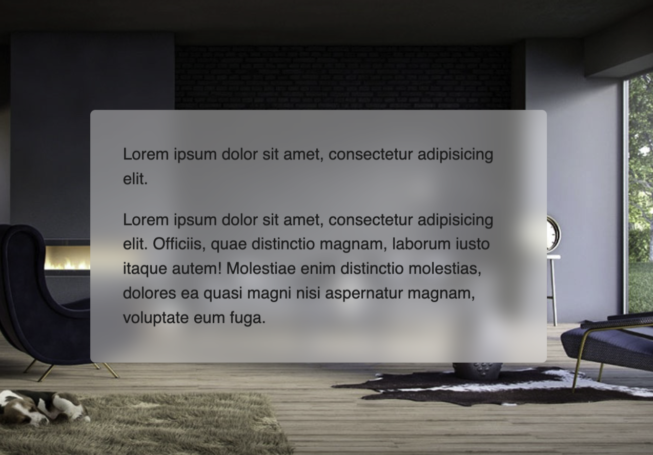
Check out the full snippet here in @codepen
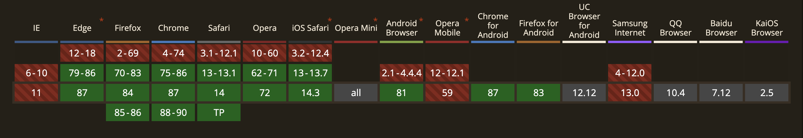
Browser Support 🖥
This browser support data is from Caniuse, which has more detail. A number indicates that browser supports the feature at that version and up.
Reference 🧐
Thanks for reading the article ❤️
I hope you enjoy learning from the article, let me know if you have any questions on @suprabhasupi 😋