CSS Border

CSS border property is used to set the border of an HTML element.
The border property is shorthand for three sub-properties that define the style, color, and width of a border.
Example:border: 1px solid red;border: border-width border-style color;border-width 👻
Sets the thickness of the border. Defaults to medium if absent.
border-width: thin | medium | thick;OR
border-width: border-top-width border-right-width border-bottom-width border-right-width;border-width: 0 4px 8px 12px;border-style 🙅♀️
Sets the style of the border. Defaults to none if absent.
border-style: none | hidden | dotted | dashed | solid | double | groove | ridge | inset | outsetcolor 🎨
Sets the color of the border. Defaults to currentcolor if absent.
border-color: red;border-color: border-top-color border-right-color border-bottom-color border-right-colorborder-color: red yellow green pink;CSS Individual Borders
The border sub-properties and property can also be applied to an individual side of a web element.
Syntax:border-left: green;border-top: pink;border-right: blue;border-bottom: skyblue;border-inline ✣
This maps to a physical border style depending on the element's writing mode, directionality, and text orientation
border-inline-start: 8px solid red;
border-inline-end: 8px solid red;
border-inline-start-style/border-inline-end-style ✣
The border-inline-start-style CSS property defines the style of the logical inline start/end border of an element, which maps to a physical border style depending on the element's writing mode, directionality, and text orientation.
border-inline-start-style: dashed;writing-mode: horizontal-tb;border-inline-end-style: dotted;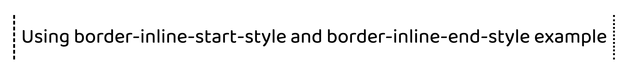
border-block ▀
The border-block-end CSS property is a shorthand property for setting the individual logical block-end border property values in a single place in the style sheet.
Syntax:border-block-end: border-block-end-width border-block-end-style border-block-end-color;border-block-start: 1px solid red;
border-block-end: 1px solid red;
border-image 🏙
The border-image CSS property draws an image around a given element. It replaces the element's regular border.
Syntax:border-image: source || slice / width / outset || repeat;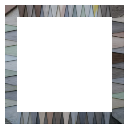
- border-image-outset
- border-image-repeat
- border-image-slice
- border-image-source
- border-image-width
1️⃣ border-image-outset
The border-image-outset CSS property sets the distance by which an element's border image is set out from its border box.
The distance of the border image from the element's outside edge. Up to four values may be specified.
The parts of the border image that are rendered outside the element's border box with border-image-outset do not trigger overflow scrollbars and don't capture mouse events.
// this will be insideborder-image-outset: 0;
// this will be outside of div 30pxborder-image-outset: 30px;
The border-image-outset property may be specified as one, two, three, or four values.
Each value is a length/number. Negative values are invalid and will cause the border-image-outset declaration to be ignored.
border-image-outset: 1px 3px 4px 10px;2️⃣ border-image-repeat
The border-image-repeat CSS property defines how the edge regions of a source image are adjusted to fit the dimensions of an element's border image.
border-image-repeat: stretch | round | repeat | space;
/* vertical | horizontal */border-image-repeat: round stretch;
stretch
The source image's edge regions are stretched to fill the gap between each border.
repeat
The source image's edge regions are tiled (repeated) to fill the gap between each border. Tiles may be clipped to achieve the proper fit.
round
The source image's edge regions are tiled (repeated) to fill the gap between each border. Tiles may be stretched to achieve the proper fit.
space
The source image's edge regions are tiled (repeated) to fill the gap between each border. Extra space will be distributed in between tiles to achieve the proper fit.
3️⃣ border-image-slice
The border-image-slice CSS property divides the image specified by border-image-source into regions. These regions form the components of an element's border image.
/* All sides */border-image-slice: 30;
/* vertical | horizontal */border-image-slice: 10% 30%;
/* top | right | bottom | left */border-image-slice: 7 12 14 5;
The slicing process creates nine regions in total: four corners, four edges, and a middle region. Four slice lines, set a given distance from their respective sides, control the size of the regions.
- Zones 1-4 are corner regions. Each one is used a single time to form the corners of the final border image.
- Zones 5-8 are edge regions. These are repeated, scaled, or otherwise modified in the final border image to match the dimensions of the element.
- Zone 9 is the middle region. It is discarded by default, but is used like a background image if the keyword
fillis set.
The border-image-repeat, border-image-width, and border-image-outset properties determine how these regions are used to form the final border image.
4️⃣ border-image-source
The border-image-source CSS property sets the source image used to create an element's border image.
border-image-source: url('/media/examples/border-diamonds.png');
border-image-source: linear-gradient(to top, red, yellow);
border-image-source: repeating-linear-gradient(45deg, transparent, #4d9f0c 20px);
5️⃣ border-image-width
The border-image-width CSS property sets the width of an element's border image.
/* top | right | bottom | left */border-image-width: 5% 2em 10% auto;Created few border & border-image example, Checkout the link in @codepen: