Future of CSS - Container Query

A web page consists of different sections and components, and we make them responsive by using CSS media queries. There is nothing wrong with that, but it has limitations.
To use container queries we have to tell the container (the parent of the element we want to apply the query to) that we care about its dimensions, we do this with the new contain property.
CSS Containment 🔥
<h1>My blog</h1><section> <h2>Heading of a nice section</h2> <p>Content here.</p></section><section> <h2>Another heading of another section</h2> <p>More content here.</p></section>section { contain: content;}none
Indicates the element renders as normal, with no containment applied.
strict
Indicates that all containment rules except style are applied to the element. This is equivalent to
contain: size layout paint.content
If we give each
<section>the contain property with a value of content, when new elements are inserted the browser understands it does not need to relayout or repaint any area outside of the containing element's subtree, although if the<section>is styled such that its size depends on its contents (e.g. with height: auto), then the browser may need to account for its size changing).The
contentvalue is shorthand forcontain: layout paint.It tells the browser that the internal layout of the element is totally separate from the rest of the page, and that everything about the element is painted inside its bounds.
size
It does not offer much in the way of performance optimizations when used on its own.
If you turn on contain: size you need to also specify the size of the element you have applied this to. It will end up being zero-sized in most cases, if you don't manually give it a size.
layout
Indicates that nothing outside the element may affect its internal layout and vice versa.
style
Indicates that, for properties that can have effects on more than just an element and its descendants, those effects don't escape the containing element. Note that this value is marked "at-risk" in the spec and may not be supported everywhere.
paint
Indicates that descendants of the element don't display outside its bounds. If the containing box is offscreen, the browser does not need to paint its contained elements — these must also be offscreen as they are contained completely by that box. And if a descendant overflows the containing element's bounds, then that descendant will be clipped to the containing element's border-box.
When we use media queries, most of the time we care about the available width (or inline-size).
NOTE: You can review the draft document which will update as the spec is formed.
What problem do container queries solve? 🤔
When creating a responsive design you often use a media query to change the document layout based on the size of the viewport. Media queries give us the ability to size things based on ranges.
Instead of looking at the viewport size, we can look at the container size and make our layout adjustments according to the space in the container.
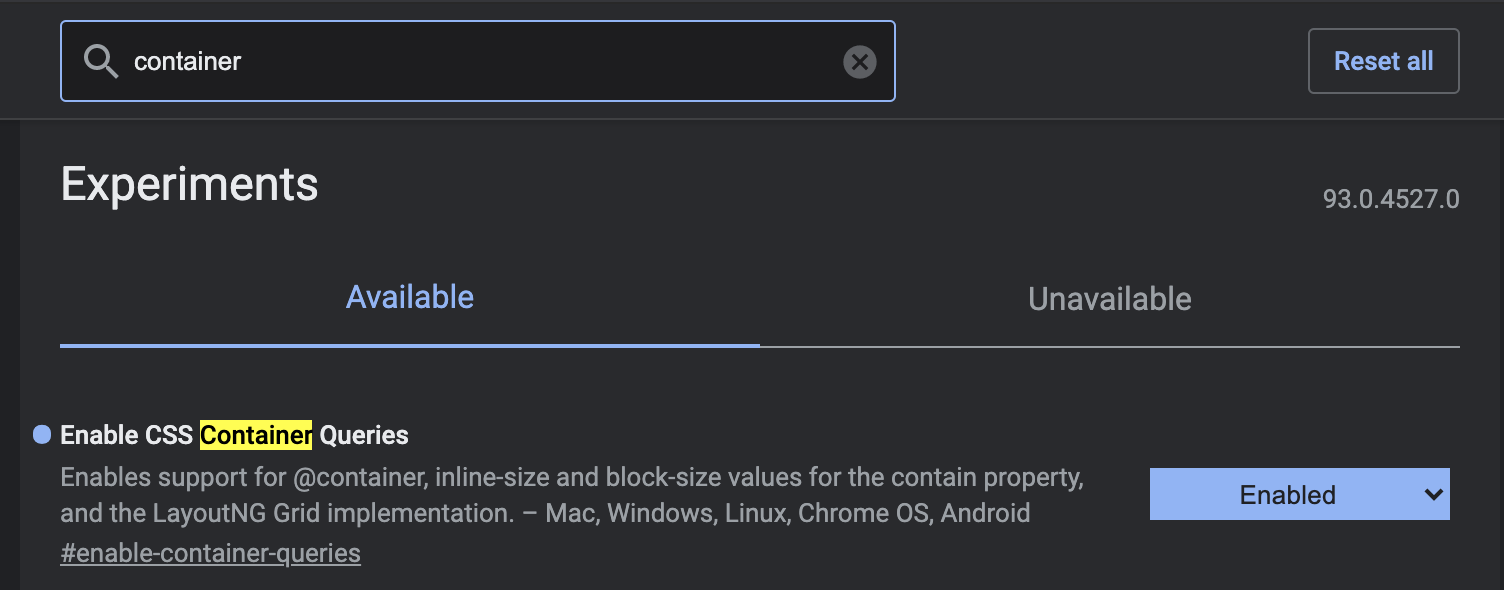
You need to install Google Chrome Canary to run this feature. Once you’ve activated the feature in chrome://flags and enable it. Then a restart chrome canary will be needed.
Now, you can then begin to write code like this:
.parent {  contain: layout inline-size;}
@container (min-width: 400px) {  .child {    display: flex;    flex-wrap: wrap;  }}
Checkout this Codepen for how it works 👇
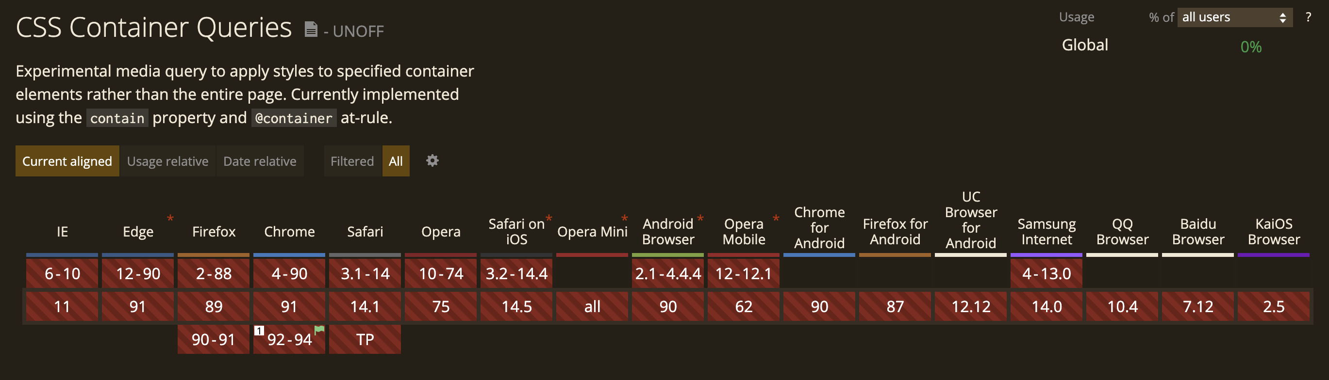
Browser Support 🌐
Support for container query is not good at this moment!
Community Input 👭
Container Query By Ahmad ShadeedReference 🧐
