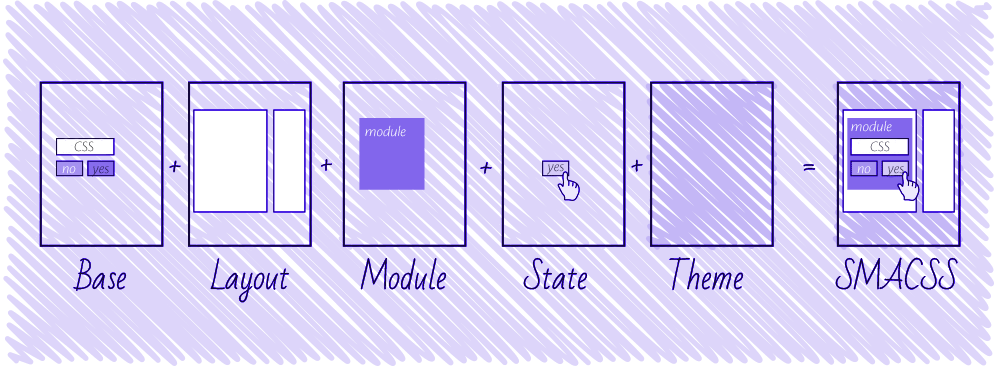
SMACSS
Scalable and Modular Architecture for CSS (SMACSS), which pronounce as `Smacks`.
SMACSS is more style guide than rigid framework.
I have read SMACSS book, and found some points which we use day to day life.
I highly recommended that you specify a body background. So, it should override default browser background color.
- Base styles include setting heading sizes, default link styles, default font styles, and body backgrounds. There should be no need to use !important in a Base style.
- CSS Reset is a set of Base styles designed to strip out or reset the default margin, padding, and other properties
- Module is a more discrete component of the page. It is your navigation bars and your carousels and your dialogs and your widgets and so on.
In Module rule, avoid ID’s and all. Use:
model > a {color: red}For state rules, Clicking on a tab will activate that tab. Therefore, an is-active or is-tab-active class is appropriate.
Remember, the use of !important should be avoided for all other rule types. Only states should have it
- Sub module naming convention: .btn, .btn-pressed, .btn-disabled
- State naming convention: `.btn, .is-pressed, .is-disabled`
- Attribute selector Convention: `.btn[data-state=default]`, `.btn[data-state=disabled]`
From CSS2.1, the three most useful pseudo-classes are the “dynamic” ones that react to user interaction:-
:hover,:focus, and:active. CSS3 adds a number of new pseudo-classes, most of which style based on HTML structure (such as:nth-childor:last-child).How CSS gets evaluated?
Checkout the below example which explain how CSS actually gets evaluated in browser:
<body>  <div id=“content" >
    <div class="module intro">        <p>Lorem Ipsum</p>    </div>
    <div class="module">        <p>Lorem Ipsum</p>        <p>Lorem Ipsum</p>        <p>Lorem Ipsum <span>Test</span></p>    </div>
</div></body>- The browser starts at the top and sees a body element. At this point, it thinks it is empty. It hasn’t evaluated anything else. The browser will determine what the computed styles are and apply them to the element. What is the font, the color, the line height? After it gets this out, it paints it to the screen.
- Next, it sees a div element with an ID of content. Again, at this point, it thinks it is empty. It hasn’t evaluated anything else. The browser gures out the styles and then the div gets painted. The browser will determine if it needs to repaint the body—did the element get wider or taller? (I suspect there are other considerations but width and height changes are the most common aspects child elements have on their parents.)
- This process continues on until it reaches the end of the document.
- For a visualization of the re ow/repaint process in Firefox, visit http://youtu.be/ZTnIxIA5KGw .
- CSS gets evaluated on right to left
- To determine whether a CSS rule applies to a particular element, it starts on the right of the rule and works its way left.
- If you have a rule like body
div#content p { color: #003366; }then for every element—as it gets rendered to the page—it will ask if it is a paragraph element. If it is then it will work its way up the DOM and ask if it is a div with an ID of content. If it finds what it is looking for, it will continue its way up the DOM until it reaches the body - By working right to left, the browser can determine whether a rule applies to this particular element that it is trying to paint to the viewport much faster
.l-inline > *- The downfall to this approach is that the rules will have to be evaluated for every single element on the page and not just the list items
- A CSS preprocessor allows you to use a special syntax in your CSS that is then compiled within your project. Some preprocessors try and stick as closely as possible to actual CSS syntax, whereas others try to simplify things as much as possible.
- Preprocessor has plenty of interesting features that can help make authoring CSS easier. A few of them are: - Variables - Operations - Mixins - Nesting - Functions - Interpolation - File importing - Extending
- Using Variable: Anybody who has worked with CSS for more than an hour has likely wished for the ability to set a colour value once in a CSS le and then to reuse that colour anywhere else in the CSS Example:
$color: #369;
body {   color: $color;}
.callout { border-color: $color; }- Mixins: A mixin is a group of styles that can be reused throughout your CSS. *Example*: Generated CSS for the border-radius mixins
.callout { -webkit-border-radius: 5px; -moz-border-radius: 5px;
 border-radius: 5px;
}- Extensions are the ability to extend one module with the properties of another. In Sass, this is done with the extend directive. *Example*:
.btn {  display: block;  padding: 5px 10px;  background-color: #003366;}
.btn-default { @extend .btn; background-color: #0066cc;}- Nesting CSS: Nested Media Queries in Sass
Example:
.nav > li {    width: 100%;
    @media screen and (min-width: 320px) {        width: 100px;        float: left;    }
    @media screen and (min-width: 1200px) {        width: 250px;    } }